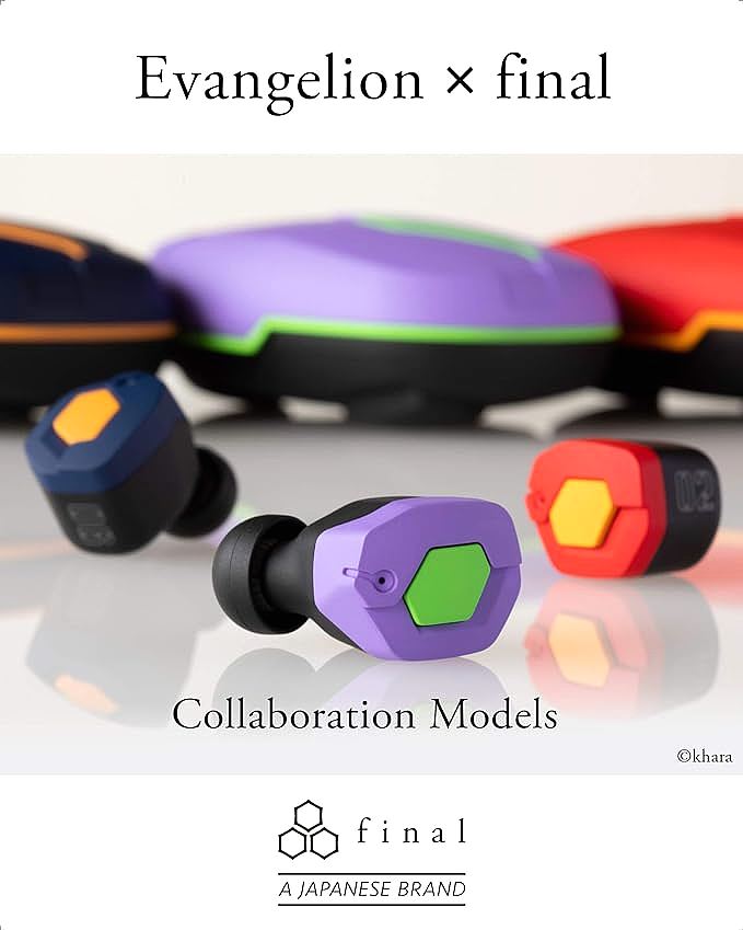
Design as Narrative: The Semiotics of Evangelion in Consumer Electronics
Update on Jan. 13, 2026, 9:04 a.m.
In the world of industrial design, “Form Follows Function” is the golden rule. But there is a parallel universe where “Form Follows Fiction.” This is the realm of the tie-in product, the collaborative edition. Often, these are cynical cash-grabs—a logo slapped on a generic chassis. But occasionally, a product achieves a true synthesis, where the fictional universe’s aesthetic principles rewrite the object’s physical reality.
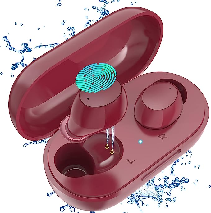
The Final EVATW(02) is one such artifact. It is not just a pair of red earphones; it is a materialized fragment of the Neon Genesis Evangelion universe. By analyzing its color theory, structural lines, and user interface (UI), we can understand how consumer electronics can serve as narrative devices, creating an emotional connection that transcends mere utility. This article explores the semiotics of mecha design, the psychology of color, and the role of audio cues in building immersion.
The Semiotics of Unit-02: Aggression and Precision
The design language of Evangelion is distinct. It blends the biological with the mechanical, the ancient with the futuristic. The Unit-02, piloted by Asuka Langley Soryu, is defined by specific semiotic markers: Red, Four Eyes, and Angular Aggression.
Color Theory: The Psychology of Red
The EVATW(02) is dominated by a specific shade of scarlet/crimson, accented with yellow/orange. * Attention & Urgency: In color psychology, red is the color of high arousal. It raises heart rate and demands attention. It fits the personality of Asuka—fiery, competitive, and dominant. * Functional Identification: In the anime, color codes the mechas. Red is Unit-02. By applying this exact Pantone shade to the charging case and earbuds, Final creates an instant Semiotical Link. The user is not just holding a case; they are holding the “entry plug” or a piece of the armor. This color blocking transforms a utilitarian object into a totem of identity.
Structural Lines: Mecha Aesthetics
Look closely at the geometry of the earbuds. They are not the smooth, organic pebbles typical of Apple or Samsung. They feature: * Hard Edges and Chamfers: The lines are angular, reminiscent of armor plating. This “Mecha Aesthetic” conveys durability, precision, and military application. * Typography: The font used for the “02” and other markings is military-industrial stencil. It suggests that this is a piece of issued equipment (NERV property), not a consumer toy. This attention to Diegetic Design (design that exists within the story world) enhances the fantasy of the user.
The Auditory Interface: Voice as Immersion
Hardware is visual, but the interface is auditory. The EVATW(02) replaces the generic “Bluetooth Connected” robot voice with the original voice recordings of Maya Ibuki (voiced by Miki Nagasawa), the NERV bridge operator.
The Fourth Wall Break
This is a masterstroke of Affective Interaction Design. * Contextual Framing: When you put the earbuds in, Maya announces the status. Suddenly, the user is framed as the pilot. The connection sequence becomes a “launch sequence.” * Emotional Resonance: For fans, Maya’s voice triggers specific emotional memories associated with the show—tension, technical competence, support. It transforms the mundane act of pairing Bluetooth into a narrative event. * Language Switching: The ability to toggle between Japanese (original) and English offers authenticity. It respects the source material’s cultural origin, acknowledging that for the “Otaku” consumer, the Japanese voice is the “true” interface.
The Packaging: The Waveform of Synchronization
Even the packaging plays a role in this narrative. The box features a waveform graphic representing the Synchronization Rate—a critical plot point in Evangelion. * The Unboxing Ritual: Unboxing is the first touchpoint. By presenting the Synchro Graph, the packaging sets a challenge: “Can you synchronize with this device?” It frames the ownership experience as a relationship between pilot and machine. * Visual Continuity: The design language extends from the box to the case to the buds. There is no break in the illusion. This Holistic Design Consistency is what separates high-end collectibles from cheap merchandise.
The Power Case: A Fuel Cell for Sound
The charging case offers a massive 950mAh battery, providing up to 63 hours of total playtime. In the context of the narrative design: * The S2 Engine: In the lore, Evangelions struggle with power limits (the umbilical cable). A battery that lasts this long can be seen as a nod to the “S2 Engine” (infinite power source). It frees the user from the “umbilical cable” of the USB charger for weeks at a time. * Industrial Utility: The case shape is functional and blocky, reinforcing the military-equipment aesthetic. It feels like a supply crate, not a jewelry box.
Conclusion: Functional Fiction
The Final EVATW(02) demonstrates that consumer electronics can be more than tools; they can be storytellers. By rigorously translating the visual and auditory language of Evangelion into the physical constraints of a TWS earbud, Final Audio has created a product that functions perfectly in the real world while keeping one foot firmly in the fictional one.
It is a triumph of Semiotics and Engineering, proving that you don’t have to sacrifice audio quality to tell a good story, and you don’t have to break the immersion to listen to music.